Case study
RefineLeap — a name that steps forward
The brief
A new studio for small businesses needed an identity that felt premium and calm, but never corporate or out of reach.
What we noticed
Symbol-based logos in this space blur together. The most ownable thing the studio had was its own name.
What we recommended
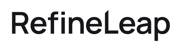
Drop the symbol entirely and let the name carry the idea — nine calm letters, then one that steps forward.
What we built
A wordmark-only logo with a lifted L, colour and type system, app icons, social avatar, favicon, a 28-page brand guideline and a set of business documents.
What changed
One consistent system across website, social profiles, documents and templates.